


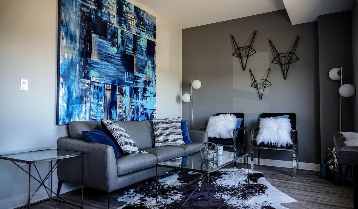
Why north light behaves so differently
Rooms facing north are often written off as the poor relations of the house. The light they receive is indirect, cool and remarkably consistent, with none of the warm gold that pours into a south-facing sitting room in late afternoon. Shadows sit soft and slightly grey, and colours can look flatter than they would elsewhere. That is not a flaw to be corrected, though. It is a quality to be worked with.
The trick is to stop thinking of blue as something to avoid in these rooms and start choosing the right blue. A clear, icy blue with a strong white base will only amplify the coolness, leaving a sitting room feeling clinical. A softer, greyer or greener blue — one with a little smoke or warmth in its make-up — behaves completely differently. It picks up the natural light, adds depth to walls that might otherwise feel washed out, and gives the room a sense of calm that warmer schemes rarely achieve.
Finding the blues that actually work
Not all blues are equal, and the differences are subtle until you see them on a wall. The most reliable choices for north-facing spaces sit in a narrow band of tones:
- Chalky grey-blues with a touch of green or slate in them, which read as soft and atmospheric rather than cold.
- Soft azure, taken a shade or two deeper than you might expect, so the colour holds its own in low light.
- Duck egg and muted teal for a slightly vintage, lived-in feel that suits period properties beautifully.
- Denim and slate blues for joinery, upholstery and accents, where a stronger tone adds welcome weight.
- Pale powder blue on ceilings or woodwork, which lifts the whole scheme without turning it sugary.
Avoid anything with a strong violet or bright cyan cast, and be wary of the palest blues, which can look grey and washed out in north light. As a rough guide, mid-tone blues with a light reflectance value somewhere around 40 to 60 tend to hold their colour best on these walls. If you want drama, use a deep blue on one wall or inside alcoves rather than across the entire room.
Warming the palette around your blue
A blue scheme only feels welcoming when there is warmth somewhere alongside it. Build this into the supporting palette rather than adding it later as an afterthought.
- Off-whites with pink, cream or yellow undertones for ceilings, cornices and adjacent walls instead of a stark brilliant white.
- Warm greys and greiges for larger surfaces, which sit comfortably next to grey-blue without competing.
- Sand, oat and biscuit tones in rugs, curtains and upholstery to ground the cooler walls.
- Blush, clay or soft terracotta as a small accent — a cushion, a lampshade, a ceramic vase — to add life without disrupting the calm.
- Antique brass, bronze or warm copper in handles and light fittings, which glow warmly against blue.
The aim is a scheme that feels layered rather than matched. Three blues of different depths plus two warm neutrals will always look more considered than a single blue repeated everywhere.
Texture does the heavy lifting
Flat colour in flat light can feel lifeless, so texture is where a blue scheme earns its keep. Choose a matt emulsion for walls to soften the light, and consider a low-sheen finish for woodwork so it catches what light there is without glaring.
Then layer materials that invite touch: a chunky wool throw, a boucle armchair, slubby linen curtains hung generously from ceiling height, a jute or wool rug with a visible weave, natural timber furniture with an honest grain, and a little rattan or woven seagrass for contrast. Add a mirror opposite the window to bounce daylight deeper into the room, and keep window treatments light enough to let every available bit of it through. In north-facing bedrooms and studies, a hint of velvet in a deeper blue adds a richness that plain fabric simply cannot match.
Lighting that flatters rather than fights
Artificial light matters twice as much in a room that never gets direct sun. Choose warm white bulbs, around 2700K, and avoid cool white or daylight bulbs, which will turn a beautiful grey-blue distinctly grey. Layer the lighting so you are never relying on a single overhead source: a floor lamp beside an armchair, a table lamp on a console, wall lights either side of a fireplace or bed, and a dimmer wherever possible.
Shades in cream, oatmeal or aged brass will cast a soft, golden pool of light, and placing lamps in the corners of a north-facing room helps to widen it visually. A small uplight behind a plant or a large vase throws gentle shadows on the walls and gives the blue surface a sense of movement.
Testing the palette before you commit
Blue is notorious for shifting with the light, so never choose from a small swatch under shop lighting. Paint large boards — at least A3, ideally bigger — in your two or three shortlisted colours and a couple of the whites, then live with them for a week.
- Check them at breakfast, mid-afternoon and in the evening with lamps on, because all three will look different.
- Place the boards vertically against the wall, not flat on a table, so the light hits them as it will once painted.
- Look at them next to your flooring, curtains and any fixed furniture, since these will influence how cool the blue reads.
- Paint a second coat, as coverage affects depth, and leave a strip of your existing wall colour beside it for comparison.
Once you have settled on your blue, commit to it across woodwork, radiators and any built-in shelving. Carrying the colour through gives a north-facing room coherence and quietness, rather than the patchwork feel that comes from stopping and starting at every edge.


Leave a reply